FamousVisions.com is your one stop shop for all your graphic design, printing, promotional product, custom apparel, website and marketing needs.
MENU
Mobile Websites
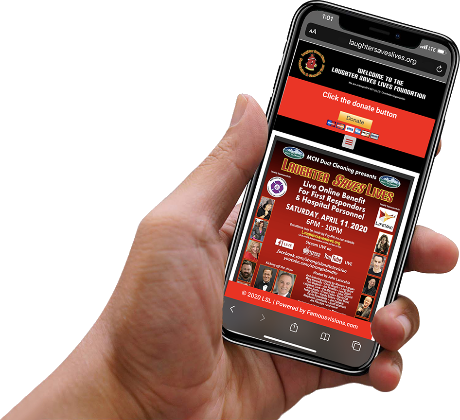
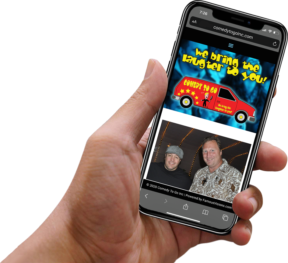
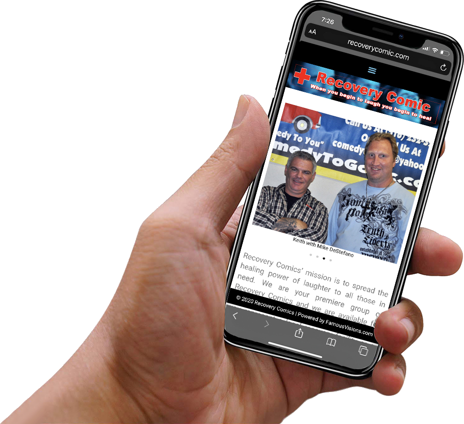
Desktop and Mobile Friendly Websites that will get you noticed!
The web used to be explored on a large desktop screen. Today the trend shows more people browse the internet using their mobile devices. The problem is that what may look great on a desktop or laptop may not be optimized to view on a smaller tablet or mobile phone.
We understand that some people still use their desktops so we make our websites friendly to use in both the desktop environment and mobile world. We can customize sections of your website to look and act differently based on the screen resolution of your device so you will always get the best of both worlds!
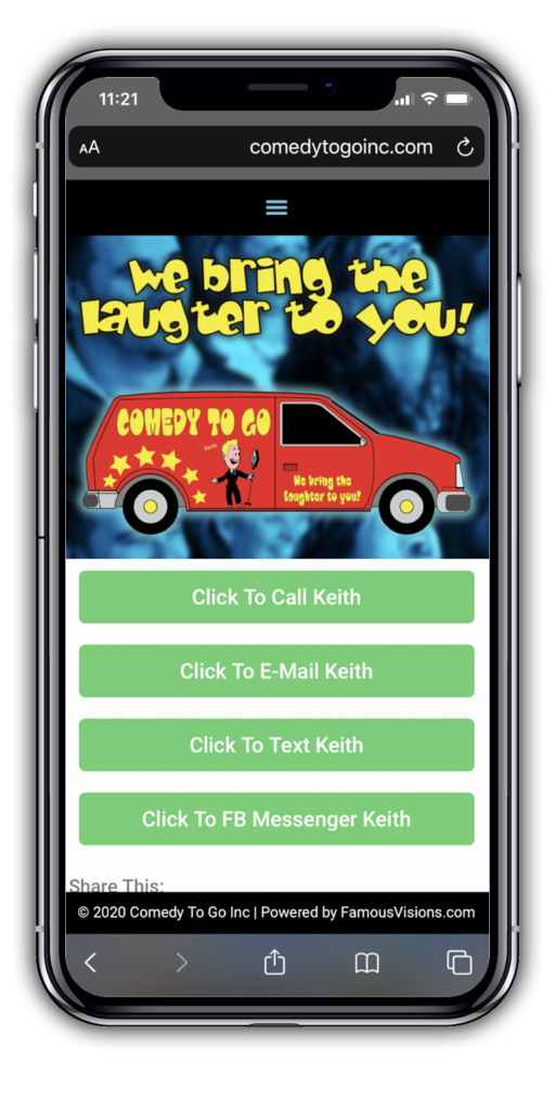
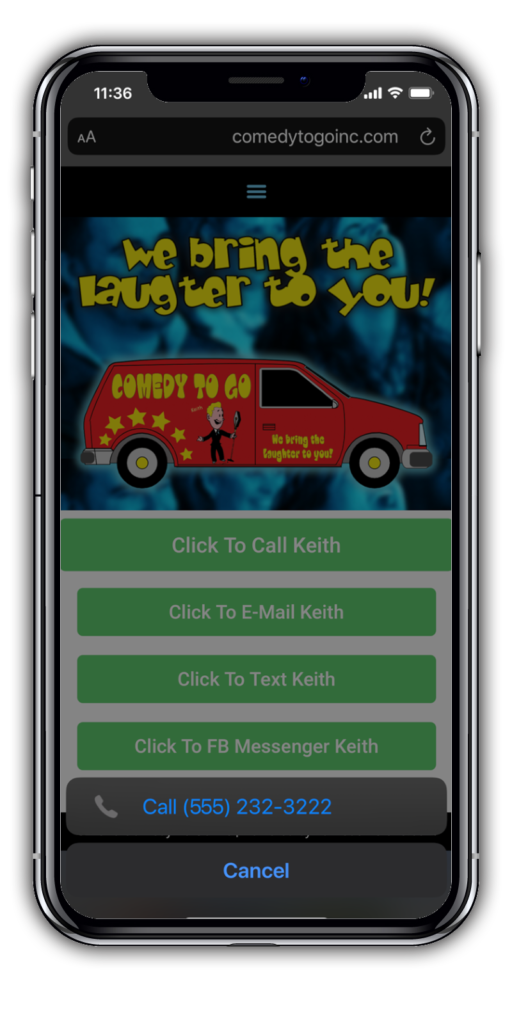
Mobile Contact Page
Just Click It!
On a mobile device the contact page for this website is all click button enabled. No typing in phone numbers or e-mails. Want to send a text message? Just a quick click of the text button and your texting application is ready to go!
We design our websites to be clean, easy to read and functional.
Click to Call Example
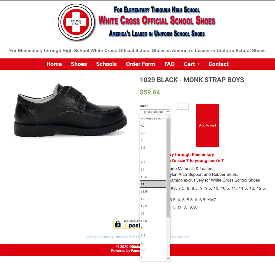
Product Page on eccomerce website
Shopping Carts
In this new world more and more people will be going online. We can set up your website to be an efficient 24/7 online marketplace. We can hook up your current pay-pal account to your cart and you’re ready to sell your products and services online!
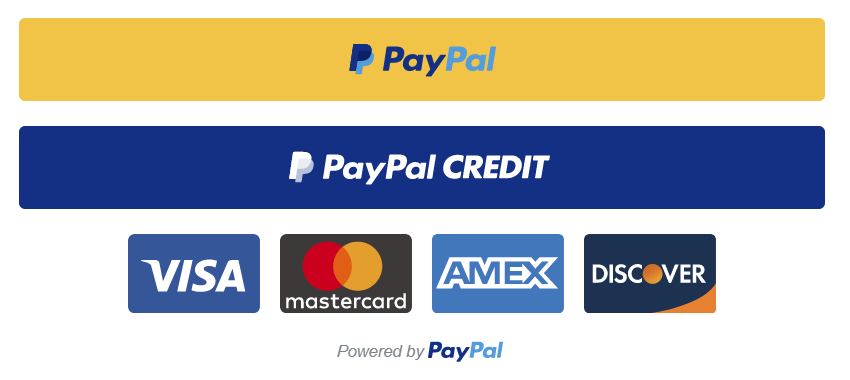
You can accept payments from Pay-pal, Pay-Pal Credit, Visa, Mastercard, Amex and Discover and only pay processing fees when a sale is made. With Pay-Pal there is no need for any additional credit card processing companies.